Banks have a broad target group and want to be able to provide them on the internet. For people with disabilities, unfortunately, it is still not always obvious. All too often websites do not offer this group the same options as other users. The websites of Dutch banks also have improvement points in this area. Curious about how ING, Rabobank, ABN AMRO, Knab, and Triodos can make their online services more inclusive? Below are the most important findings from the study listed.
Contrast
The homepage of ING looks good at first sight. The information is clearly arranged and no animations or videos stand out when the page is opened. A quick check on the contrast ratio does yield a negative result: ING Orange with white text provides insufficient contrast. This ratio (3.0) is lower than the 4.5 recommended. Visitors with color blindness in particular can encounter problems distinguishing text from the background when the contrast ratio is too low.
Rhe Rabobank scores on contrast are a lot better than ING, with a ratio of 17 for the general text and heads. Rabobank-Oranje, just like ING-Oranje, does not score enough. This color orange also has a contrast ratio of 3.
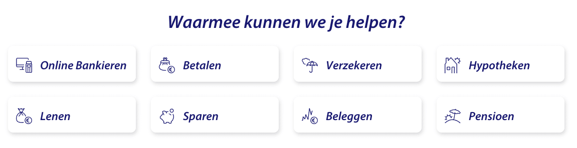
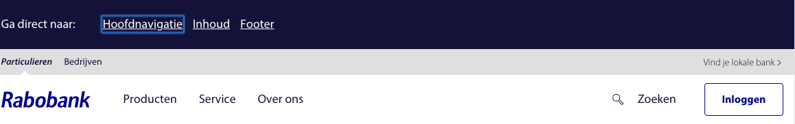
Furthermore, the structure that the Rabobank website offers is clear. Under the banner, 8 options are offered that can be seen in the image below. By offering well-arranged and calm menu structures, it becomes easier for everyone to navigate through the website.
The ABN AMRO is the first bank in the list that (almost!) Fully meets the guidelines regarding the contrast of the WCAG. Only the banner at the bottom of the site (service and contact) does not meet the minimum ratio of 4.5.
Knab profiles itself as an online bank, this means that Knab does not have to pay attention to the accessibility of physical benches that are visited. In theory, full attention can therefore be paid to making the website accessible. Unfortunately, the reality is less rosy. A large part of the text on the homepage does not meet the contrast ratio. Fortunately, this is one of the most serious defects in the field of digital accessibility.
Triodos already mentions that the website was built with digital accessibility in mind. This is reflected in the results. The bank is the only one on the list where all contrast ratios are higher than 4.5 and therefore meet the guidelines.
Navigate with keyboard
for internet users with reduced mobility or reduced visibility, the use of a keyboard instead of a mouse is a solution. This group on the web often depends on websites that can be navigated via a keyboard. By clearly indicating which button the user is currently, the use of a navigation keyboard is simplified. This can be done by an edge to install the current button, or to apply a slight change in color.
The website of ING is easy to use with just a keyboard. However, it is not clear which button or links the user is currently being. Other banks do this better.
The Rabobank can also be used with just a keyboard. As soon as a user ends up on the website and “tab” presses, an extra banner appears. This banner gives the user the opportunity to jump directly to the content or footer, without having to press tab several times.
Just like on the websites of the other banks ABN AMRO can be visited digitally with just a keyboard. Yet there is room for improvement.
Just like the other banks, the website of Knab can also be used with a keyboard. Only at the bottom left, in the footer, is it not clear which link is selected. This does not benefit the accessibility of the website, not at all because the most important links are listed here. The sofa can easily solve this by giving the selected item a different color and underline.
Triodos, just like Rabobank, has special hyperlinks that appear when the keyboard is used to navigate by the site. This way, users can choose whether they want to use the main navigation or want to go directly to the head content.
images for blind and visually impaired
People who are blind or visually impaired depend on alternative descriptions of images to understand them. If images have no alternative description, they do not exist for the blind.
The images on the homepage of the ING do not have such an alternative description. The other banks have alternative descriptions of images in order. All photos, illustrations, and other images on the homepage are provided with this description.
accessible hyperlinks
left, especially buttons without text, can be made more accessible by giving a title to the button in the code. This way, fencers know what the user can expect if he clicks on the button. All benches in the list drop on this field.
to 200%
According to one of the WCAG guidelines, a website must be able to enlarge up to 200% and are still functional and visually attractive. This is required so that users with a visual impairment can adjust the format of text. All banks in this study meet this guideline.
Subtitles of videos
The videos that ING uploaded to the YouTube channel, LinkedIn and Facebook are much equipped with subtitles. Unfortunately, not all videos have been transcribed, so that people with an auditory disability cannot understand the videos. A bad thing, because there are also informative videos online without subtitles.
the digital videos of ABN AMRO, Rabobank, and Knab are in line with those of The other banks. All too often no subtitles are used on YouTube, but on social media, almost every video can be followed without audio. At Triodos, there was only a single video on the YouTube channel that was not subtitled.
Digital accessibility in practice
Many of the necessary changes mentioned above are fairly easy to apply. The first step in making a website or app accessible is knowing what needs to be done. Digital accessible.com helps companies, organizations and municipalities in designing and realizing accessible online products. Want to know more about how we do this? Then visit the contact us directly for more information.